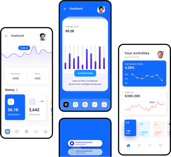
100% Responsive Design
- Home
- 100% Responsive Design

Creating a 100% responsive design for a mobile app is essential to ensure that it functions well on a wide range of devices, screen sizes, and orientations. Here are some key principles and best practices for achieving a fully responsive mobile app design:
Use a Mobile-First Approach: Start your design process with a mobile-first approach. This means designing for mobile devices first and then progressively enhancing the layout and features for larger screens. This approach ensures that your app will work well on smaller screens and then adapt gracefully to larger ones.
Fluid Layouts: Use fluid or flexible layouts that adapt to the available screen size. Avoid fixed-width designs that can't adjust to different devices. CSS Grid and Flexbox are valuable tools for creating fluid layouts.
Media Queries: Implement CSS media queries to apply different styles based on screen size. These queries allow you to adjust font sizes, margins, and other design elements for various breakpoints, ensuring a good user experience on different devices.
Scalable Images: Use scalable vector graphics (SVGs) for icons and images whenever possible. For raster images, provide multiple sizes and resolutions to ensure crisp visuals on various devices. Use responsive image techniques such as the "srcset" attribute in HTML.
Touch-Friendly Design: Make sure that your app is touch-friendly by using appropriately sized touch targets, ensuring that buttons and interactive elements are easy to tap, swipe, and interact with on smaller screens.
Typography: Choose legible fonts and font sizes that are readable on mobile devices. Adjust line spacing and line lengths for different screen sizes. Consider using responsive typography techniques to scale fonts based on screen width.
Navigation: Simplify your app's navigation for mobile devices. Use hamburger menus, tab bars, or other mobile-friendly navigation patterns to make it easy for users to access different sections of your app.
Content Prioritization: Prioritize and organize content based on its importance and relevance to mobile users. Avoid clutter and unnecessary elements, focusing on the core features and information.
Testing: Thoroughly test your app on a variety of real mobile devices and emulators to ensure that it performs well across different screen sizes, resolutions, and orientations. Pay attention to usability, load times, and any visual glitches.
Cross-Browser Compatibility: Ensure that your app works across various mobile browsers and their versions. Test on popular browsers like Chrome, Safari, Firefox, and Edge to catch any compatibility issues.
Accessibility: Implement accessibility features to make your app usable by individuals with disabilities. This includes providing alternative text for images, keyboard navigation, and ARIA roles and attributes.
Performance Optimization: Optimize your app's performance for mobile devices by minimizing HTTP requests, using responsive images, and leveraging browser caching. Faster-loading apps provide a better user experience.
User Testing: Gather feedback from real users through usability testing and beta testing to identify any issues and make necessary improvements to your responsive design.

Instant free download from store Cloud based storage for your data backup just log in with your mail account from play store and using whatever you want for your business purpose orem ipsum dummy text.


 Get It On
  Download on the